

In our quest to make sense of the world, we are naturally drawn to simplicity and predictability. We seek straight lines: relationships where doubling the cause doubles the effect. This linear worldview is the foundation of much of our scientific training, and it is powerfully served by statistical tools like the Pearson correlation coefficient. However, this reliance on linearity often becomes a blindfold, hiding the true complexity and beauty of nature. The universe is rarely straightforward; it is filled with curves, cycles, tipping points, and feedback loops—phenomena that linear models are utterly blind to. This article addresses this critical gap, moving beyond the limitations of simple correlation to explore the rich world of non-linear dependence.
This journey will unfold across two main parts. In the first section, "Principles and Mechanisms," we will deconstruct the common statistical tools we use, revealing why they fail in the face of non-linearity and exploring the crucial role of data visualization. We will then introduce more sophisticated methods that can detect and quantify these complex relationships. Following that, in "Applications and Interdisciplinary Connections," we will see these principles in action, touring a vast landscape of scientific fields—from cosmology and chemistry to biology and economics—to witness how non-linearity is not a nuisance, but the fundamental architect of structure, risk, and life itself. By the end, you will have a new appreciation for the curves that shape our world and the tools needed to understand them.
In our journey to understand the world, we are constantly on the lookout for relationships. Does more sunlight make a plant grow taller? Does more studying lead to better grades? We have a powerful and seemingly intuitive tool for this hunt: the Pearson correlation coefficient, usually denoted by the letter . It gives us a single number, from -1 to +1, that promises to tell us how strongly two things are related. A value near +1 suggests a strong positive relationship (as one goes up, the other goes up), a value near -1 suggests a strong negative one (as one goes up, the other goes down), and a value near 0 suggests no relationship at all. It’s elegant, simple, and incredibly useful.
It is also, if we are not careful, a master of deception.
The first and most important thing to understand about the Pearson correlation coefficient is that it has a very particular worldview. It sees the world through "linear-tinted glasses." It is fundamentally designed to measure the strength and direction of a linear association—how well a cloud of data points can be described by a single straight line. The formula for is built upon the idea of covariance, which captures how two variables vary together from their respective means. If they tend to be on the same side of their means at the same time (both high, or both low), the covariance is positive. If they are on opposite sides, it's negative.
The problem, of course, is that nature is rarely so straightforward. The universe is filled with curves, cycles, and tipping points. To rely solely on a tool that looks for straight lines in a world of wiggles is to risk missing the most interesting parts of the story.
Imagine an ecologist studying a species of nocturnal insect. She notices that these insects are most active at a moderate, "just right" temperature. If it’s too cold, they are sluggish. If it’s too hot, they are also sluggish. If you were to plot their activity level against the temperature, you would see a beautiful, clear pattern: an inverted 'U' shape. There is undeniably a strong relationship between temperature and insect activity. The temperature tells you a great deal about what the insects will be doing.
And yet, if our ecologist were to blindly calculate the Pearson correlation coefficient for her data, she would find that is very close to 0. A zero correlation! The statistic screams, "There is no relationship here!" But our eyes tell us otherwise. What's going on?
This is a classic statistical trap. The correlation coefficient is being tricked by symmetry. On the left side of the optimal temperature, as temperature increases, activity increases—this is a positive trend. On the right side, as temperature continues to increase, activity decreases—a negative trend. When the correlation formula crunches all the numbers, these two opposing trends effectively cancel each other out. The positive contributions to the covariance from one side are nullified by the negative contributions from the other.
We see this same story play out in many fields. An engineer testing a new thermal sensor finds that its measurement error is smallest at its calibrated setpoint and grows larger as the temperature deviates, either colder or hotter. The plot of error versus temperature deviation is a perfect U-shape. The relationship is deterministic and strong, yet the correlation is exactly zero. A similar, if more anecdotal, pattern is often described for last-minute cramming and exam scores: a little cramming helps, but too much leads to fatigue and diminishing returns, forming another inverted U-shape where the overall linear correlation might be zero despite a clear connection.
We can even prove this mathematically. For a dataset where the relationship is symmetric, like over an interval from to , the calculation for the slope of the best-fit line (which is directly related to the correlation) involves summing up terms of the form . Since the values are symmetric around zero, for every positive , there's a corresponding negative , and the grand sum is zero. A zero slope means zero linear correlation. The tool designed to find a straight line correctly reports that the best straight line is flat, but it completely misses the perfect parabola that the data points trace.
So, a zero correlation can hide a strong relationship. But surely a high correlation must mean a strong linear relationship, right? Not so fast.
Consider a chemistry student titrating an acid with a base, plotting the solution's pH against the volume of base added. The resulting curve is famously S-shaped (sigmoidal). It's clearly not a straight line. Yet, because it's a strongly increasing, monotonic trend, the student might calculate a correlation coefficient as high as . It's easy to fall into the trap of reporting a "strong linear relationship," when the underlying process is fundamentally non-linear. The high value is just an artifact of the data being stretched out in one general direction.
The most famous and devastating illustration of this entire problem is a set of four small datasets known as Anscombe's Quartet. Devised by the statistician Francis Anscombe in 1973, it is a masterpiece of statistical pedagogy. Each of the four datasets consists of 11 pairs. When you compute the standard summary statistics for each dataset, you find something astonishing: they are all virtually identical. They have the same mean of , the same mean of , the same variance for each, and the same Pearson correlation coefficient (). They even have the exact same best-fit linear regression line ().
Based on these numbers, you would conclude that the four datasets tell the same story.
Then you plot them.
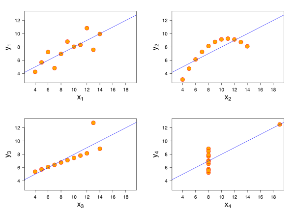
The first plot (top left) looks just as you'd expect: a noisy but clear linear trend. The correlation of and the regression line make perfect sense here. The second plot (top right), however, is a perfect, smooth curve—a parabola. There's no hint of linearity. The third plot (bottom left) shows a perfect straight line, but with one glaring outlier that has dragged the regression line and the correlation coefficient off course. And the fourth plot (bottom right) is even stranger: all but one of the points are clustered at the same value, with a single influential outlier defining the entire trend.
Anscombe's Quartet teaches us the most important lesson in data analysis: Always, always visualize your data. Summary statistics, on their own, are like reading a book's table of contents and thinking you've understood the novel. They can be profoundly misleading, hiding non-linearity, outliers, and all sorts of other interesting features that define the true character of the relationship. The world is full of these complex stories, like the number of baby teeth a child has, which first increases, then plateaus for a few years, then decreases—a pattern no single straight line could ever hope to capture.
If we can't always trust the correlation coefficient, how can we check if our linear model is a good fit? One of the most powerful diagnostic tools is the residual plot. A residual is simply the error of the model for a single data point: the difference between the actual observed value () and the value predicted by the linear model ().
Think of the residuals as the "leftovers"—what the model couldn't explain. If the linear model is a good description of the data, the leftovers should be random and formless, like stray crumbs scattered around zero. But if the model is wrong, the residuals will often contain an echo of the pattern that the model missed.
Imagine a biochemist studying an enzyme reaction, measuring the product formed over time. The data points seem to be rising, so she fits a straight line. But when she plots the residuals (the errors) against the time variable, she doesn't see random noise. Instead, she sees a clear, systematic U-shaped pattern. The residuals are positive at the beginning and end, and negative in the middle. This "smile" in the residuals is a tell-tale sign that the true relationship is curving away from the straight line she tried to impose on it. The data wanted to be a parabola, and the residual plot reveals the ghost of that parabola. Listening to these echoes is a crucial skill for any scientist.
So, we've seen that correlation is a limited tool and that visualizing data and its residuals is essential. But what if we need a number—a metric that can actually quantify these more complex relationships? Fortunately, statistics has evolved, providing us with more sophisticated tools that don't wear "linear-tinted glasses."
One such tool comes from the field of information theory: Mutual Information. Instead of asking "How well can a straight line describe the data?", mutual information asks a more fundamental question: "How much does knowing the value of one variable reduce my uncertainty about the value of the other?" This measure is sensitive to any kind of relationship, linear or not. Consider two genes whose expression levels are being measured. We might find that their Pearson correlation is zero, but their mutual information is very high. This is a huge clue! It tells us that there's a strong, predictable relationship, but it's not a simple line. For example, the protein from one gene might activate the second gene at low concentrations but repress it at high concentrations—a complex, non-monotonic relationship that is common in biology and utterly invisible to standard correlation.
For other problems, particularly in fields like finance, the average association isn't the main concern. What keeps risk managers awake at night is what happens in the extremes. Two assets might seem largely uncorrelated in day-to-day trading, giving a low Pearson correlation. But during a market crash, they might both plummet in perfect lockstep. This phenomenon, called tail dependence, is a dangerous non-linear relationship that correlation completely misses. To capture this, analysts use a powerful mathematical object called a copula. Sklar's theorem shows us that a copula can disentangle the marginal behavior of each variable from their dependence structure. This allows us to build models that specifically account for the risk that things will go very wrong, or very right, together—a much richer and more realistic view of dependence than a single correlation coefficient could ever provide.
The journey from the simple correlation coefficient to the worlds of mutual information and copulas is a journey from a one-dimensional view of the world to a multi-dimensional one. It's a reminder that our tools shape our understanding, and that to truly appreciate the beauty and complexity of the universe, we must be willing to look beyond the straight and narrow path.
We humans are creatures who love straight lines. There is a deep comfort in them. Double the cause, and you double the effect. This is the world of linearity, and a great deal of our introductory science is built upon its beautifully simple foundation. Hooke's Law tells us the stretch of a spring is proportional to the force. Ohm's Law tells us voltage is proportional to current. These are the reliable, predictable workhorses of our physical understanding.
But Nature, in her full, untamed glory, is rarely so accommodating. The moment we venture away from the gentle middle ground—pushing a little harder, looking a little closer, or allowing things to interact—the straight lines begin to curve, to twist, and sometimes, to leap. This is the domain of non-linear dependence. To the uninitiated, it may seem like a messy complication, a deviation from the ideal. But to the scientist, this is where the magic happens. It is in the realm of the non-linear that structure emerges from uniformity, that memory is born from simple chemistry, and that the universe builds itself. Let us take a tour of this unruly, creative world and see how its principles unite a startling array of phenomena, from the cosmos to the cell.
Our first stop is a lesson in humility. Many of the "linear" relationships we rely on are, in fact, well-behaved illusions, valid only under specific, limited conditions. Consider the work of an analytical chemist using a gas chromatograph to measure the concentration of a gas. At low concentrations, the detector's signal is beautifully proportional to the amount of substance—a perfect straight-line calibration. But as the concentration increases, the line begins to droop. The signal is less than expected. Has the machine broken? No. The physics of the detector, which depends on the thermal conductivity of a gas mixture, was never truly linear in the first place. The straight line was merely the first term in a Taylor series, an approximation that is excellent for small amounts but inevitably fails when the amounts become large. This is a ubiquitous story in science and engineering: what we often call a linear system is just a non-linear system that we haven’t pushed hard enough yet.
Nowhere is the danger of assuming linearity more apparent than in economics and finance. A classic test of the "weak-form efficient market hypothesis" is to check if a stock's past returns can predict its future returns. A simple linear correlation test often shows no relationship whatsoever; the ups and downs appear to be a random, unpredictable walk. Yet, traders have long had the intuition that "volatility comes in clusters"—a day of large price swings, up or down, is likely to be followed by another. This is a profound non-linear dependence. The size of tomorrow's price swing (its volatility) is dependent on the size of today's swing, even if their directions are uncorrelated. A linear test is completely blind to this. To see this hidden structure, we need more powerful, non-linear tools like the Hilbert-Schmidt Independence Criterion (HSIC), which can detect any form of dependency, not just the straight-line kind. This reveals that while the market's direction may be a random walk, its riskiness is not.
This blindness of linear correlation to what truly matters can have catastrophic consequences. Imagine an engineer designing a coastal flood barrier. The two critical factors might be storm surge height and river outflow. A simple analysis might show only a weak linear correlation between them. But what if they have a sinister, non-linear connection known as "tail dependence"? This means that while they behave independently most of the time, they have a strong tendency to be extremely high at the same time. A rare but powerful storm might produce both a massive surge and trigger record rainfall, causing the river to swell. A standard reliability model based on simple correlation, which assumes a Gaussian copula, would drastically underestimate the probability of this joint extreme event and lead to an unsafe design. A more sophisticated approach using copulas that can capture tail dependence—like the Gumbel copula—reveals the true, higher risk, leading to a more robust structure. In fields like structural reliability and risk management, understanding non-linear dependence isn't an academic exercise; it's a critical tool for preventing disaster.
If non-linearity is more than just a high-concentration problem, where does it come from? Often, it is baked into the fundamental laws of the universe. In chemistry, one of the most important relationships is the Arrhenius equation, which describes how the rate of a chemical reaction, , changes with temperature, . If you plot versus , you don’t get a straight line; you get a curve that sweeps dramatically upward. This exponential relationship, , is the signature of a thermally activated process. Molecules in a substance have a range of energies; the reaction proceeds only when molecules collide with enough energy to overcome a barrier, the activation energy . As temperature rises, the fraction of molecules possessing this much energy explodes exponentially. Here, the non-linearity is a direct window into the microscopic world of molecular collisions. Cleverly, a chemist can tame this exponential beast by plotting the natural logarithm of the rate constant, , against the inverse of the temperature, . This mathematical trick transforms the curve into a straight line, whose slope directly reveals the hidden activation energy.
This theme of non-linear material response is everywhere. The linear world of a Newtonian fluid like water, where the drag force is proportional to velocity, is the exception, not the rule. Consider a specialized damper in a robotic arm filled with a "shear-thickening" fluid. Stir it slowly, and it feels liquid. Try to move the piston quickly, and the resistance becomes immense. The resistive force grows not as velocity , but as , where the exponent is greater than one. This non-linear behavior comes from the microscopic structure—perhaps a dense suspension of particles—that jams together under high shear.
The same principles apply to the electromagnetic properties of materials. A simple dielectric material polarizes in proportion to an applied electric field. But a ferroelectric material is far more interesting. Even above its "Curie temperature" where it is not spontaneously polarized, its susceptibility to an electric field is not constant. It follows the Curie-Weiss law, where the susceptibility is inversely proportional to how far the temperature is from a critical temperature : . As the material is cooled toward , its response to the same electric field becomes dramatically, non-linearly larger. This skyrocketing sensitivity is the harbinger of a phase transition—a collective phenomenon where all the tiny atomic dipoles in the material are about to snap into alignment in unison. Non-linearity, in this sense, is the language of cooperation and collective change.
The true power of non-linearity is not just in describing the response of a material, but in its ability to create complexity and structure from simple beginnings. It is the grand architect of our world.
Take the universe itself. We observe a cosmos filled with a rich tapestry of galaxy clusters, filaments, and vast empty voids. Yet, our observations of the cosmic microwave background tell us that the early universe was astonishingly smooth, with only minuscule density fluctuations, differing by just one part in 100,000. How did such a uniform state evolve into the lumpy, structured universe of today? The answer is gravity, acting non-linearly over billions of years. A region that was initially just a tiny bit denser than its surroundings exerted a slightly stronger gravitational pull. It drew in matter from its neighbors, becoming even denser, which increased its pull further. It's a classic "the rich get richer" scheme. This process of hierarchical clustering is purely non-linear. Theoretical models show how this gravitational evolution transforms the initial, simple power-law spectrum of fluctuations into the complex, non-linear correlation function of the galaxies we see today, with the final structure's properties being a direct, albeit non-linear, consequence of those initial conditions.
This creative power of non-linearity is the very essence of life. In genetics, we learn that traits can be influenced by multiple genes. If their effects were simply additive, the story would be linear. But genes interact. The effect of one gene often depends on the presence or absence of another—a phenomenon called epistasis. This interaction immediately introduces non-linearity. For example, in a simple model of inbreeding depression without epistasis, the average fitness of a population declines linearly as the inbreeding coefficient increases. But once we allow for interactions between genes, the relationship becomes a curve; the mean phenotype becomes a quadratic or even more complex function of . The shape of this non-linear curve is a signature of the underlying genetic architecture of the trait.
Going deeper, to the level of a single cell, non-linearity provides the mechanism for one of biology's greatest mysteries: memory. How does a cell "know" what it is? How does a liver cell, after dividing, produce two liver cells? The answer lies in bistable switches built from genetic circuits. A common motif is a protein that activates the transcription of its own gene. If this positive feedback were linear, the protein level would either die out or grow forever. But the synthesis rate is not linear; it is typically a sigmoidal (S-shaped) function of the protein's concentration. This non-linear shape is crucial. It means that there can be three points where the synthesis rate exactly balances the degradation rate. Two of these steady states are stable: one with a low protein concentration ("OFF") and one with a high concentration ("ON"). The state in the middle is unstable. A transient external signal can push the cell from the "OFF" to the "ON" state, where it will remain even after the signal is gone. This is a memory switch, created entirely by non-linear dynamics. It is this kind of non-linear circuit that underlies cellular decision-making, differentiation, and the stability of life itself.
Given that non-linearity is so fundamental, how do scientists grapple with it? We have developed clever tools not to fear the curve, but to embrace it and learn from it.
One approach is to proactively search for it. When designing an experiment to optimize a process, like the efficiency of a solar cell, we might test high and low levels of various factors (e.g., temperature and concentration). A standard factorial design allows one to estimate the linear effects of each factor. But how do we know if the true relationship is curved? A brilliant and simple strategy is to add a few experimental runs at the exact center of all the factor ranges. If the world were linear, the response at this center point should be exactly the average of the responses at the corners of the experimental space. If it isn't, the difference is a direct measure of curvature. This is a powerful way to let the experiment tell us whether our simple linear model is sufficient.
Often, however, we don't have the luxury of designing an experiment; we just have observational data. We might see a complex relationship, like the famous Kuznets curve in economics, which hypothesizes that income inequality first rises and then falls as a country develops. How can we model such a relationship without forcing it into a preconceived shape like a parabola? A powerful, modern technique is to use splines. A cubic spline, for example, fits the data by piecing together a series of small cubic polynomials, ensuring that the resulting overall curve is smooth and continuous. This flexible, data-driven approach allows the model to bend and curve as needed to follow the data, providing a faithful representation of a non-linear trend without imposing strong theoretical assumptions.
Our journey has taken us from the mundane to the profound. We began by seeing the cracks in our simple, linear worldview in a chemistry lab. We then found non-linearity as a fundamental signature of physical law in chemical reactions, flowing materials, and exotic crystals. We saw its crucial importance in understanding risk, from the financial markets to the engineering of safe structures. Most profoundly, we have seen non-linearity as the great creative engine of the universe—the architect of the cosmic web and the dynamic mechanism behind cellular memory and life. The straight line may represent the simple, the solved, the easily predictable. But it is in the curves, the twists, and the sudden leaps of the non-linear world that the deepest secrets, the most complex structures, and the greatest beauty of our universe are to be found.